My brain doesn't quite have the capacity that many other developers have. Steep learning curves or lists with anything more than 5 items in them really rack my brain. Words longer than 12 characters are like having a piece of large pulp in my glass of smooth orange juice. They really disrupt my information consumption.
Quite a few bloggers keep it simple and I really enjoy their formats. So much so that I make it a goal in most of my posts to present a really basic topic. One that can be learned quickly and integrated into a website in a snap.
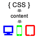
The concept behind using CSS Media Queries to produce device-specific content is extremely simple, as is the implementation. So I'll spend more time on examples of where this technique can be used effectively.
The Problem
You need to create a JavaScript solution that it portable (can be dropped into any application), but it appends HTML and/or text to the DOM.
Given the wide range of devices (desktop, tablet, mobile) that will run this JavaScript, one of two problems may occur:
- The text is dependent on the type of device. For example:
"Your computer does not have an image capture device." -> Does not make sense for mobile.
vs.
"Your device does not have image capture capabilities." -> Slightly confusing on a PC.
- The text is too long for mobile devices. For example:
"JavaScript is not enabled in your browser. This app requires JavaScript".
vs.
"JavaScript required" -> May fit better on a mobile device.
You're immediately thinking, "this would be extremely easy with a server-side language" or "you can just detect screen width with JavaScript".
We can't do it server-side because we want our JavaScript library to port to other applications easily. Also, if we create these conditions in JavaScript, that will require anyone who needs to modify the text or the conditions to actually change the JavaScript code.
The Solution
I spoiled the surprise in the title of the article. CSS Media Queries are the answer to both problems above.
The content "style" is the magic behind this approach.
p:before { content: "Setup your computer"; }  /* for desktop */

@media (max-width: 1024px) {
    p:before { content: "Setup your device."; }  /* for tablet / mobile */
}
It's not Perfect
Obviously, this solution is not fool-proof. A desktop user might have their browser window set very narrow (less than 1024 pixels wide), which will cause them to see the message targeted at mobile devices or tablets.
However, it is better than blindly sending the same device-specific message to users on every device.
Use Cases
Here are a few use cases that I came up with. I'm sure there are dozens more.
- PhoneGap
When considering when to use this approach, the very first thing that came to mind is PhoneGap. What better place is there to employ CSS-based content than when server-side a language isn't available.
I haven't used PhoneGap in a few months, so I'm not sure if better options have presented themselves since. In either case though, using CSS Media queries to decide on "notification-type" content is a very simple and maintainable approach.
.message:before { content: "Shake your tablet to randomize."; } /* for tablet */ @media (max-width: 480px) { .message:before { content: "Shake your phone to randomize."; } /* for mobile */ } - Device type in message
The second most obvious use case is when you mention the type of device in the message. The example shown in the solution above is one such case. To further the example:.message:before { content: "Your computer is not connected to the internet."; } /* for desktop */ @media (max-width: 1024px) { .message:before { content: "Your device is not connected to the internet."; } /* for tablet and mobile */ }Login Form
[ ] Remember me on this machine.
This one always cracks me up, like anyone has ever called their iPhone a "machine".#persist-label:before { content: "Remember me on this computer."; } /* for desktop */ @media (max-width: 1024px) { #persist-label:before { content: "Remember me on this device."; } /* for tablet and mobile */ } - Click or tap
a:before { content: "Click here"; } /* for desktop */ @media (max-width: 480px) { a:before { content: "Tap here"; } /* for mobile */ } - Messaging based on width
@media (max-width: 320px) { /* for mobile */ .usability-message:before { content: "This tool works best in landscape orientation."; } } -
Device incompatibilities
@media (max-width: 480px) {
    .usability-message:before {
        position: fixed;
        bottom: 0;
        content: "We know, this website looks terrible on your phone!";
    }
}

A Note about Units
It has been suggested that you avoid using pixel units within @media breakpoints, as it can break layouts when zooming. In this case though, we're not using @media for layout purposes, solely for content.
Let's also not forget about the inches and centimeter units that are available within CSS . Although they are recommended only for print, they may be accurate enough to use in the future, if mobile devices offer a much wider range of resolutions.
Final Thoughts
While this technique is simple to work into your existing site, be mindful not to use it for anything except content that has little relevance. For one, some old browsers don't support the content style, and media queries are an even more recent addition to CSS.
Use it in subtle ways and I think you're users will take notice that you've customized the content for their device.
Nice idea, but it doesn’t quite work – the content property only works for :before and :after pseudo elements. However, it’s quite easy to just add those to the CSS in your examples and it will just work. Technically, the resultant element will be empty, but it will place the text in either before or after the content – doesn’t matter either way!
I’ve implemented similar techniques before, changing text for different resolutions, but only text that should be resolution dependant. Device dependant text is tricky – I’d normally check the user agent – yes it’s easy to spoof, but is that the end of the world? It’s only a bit of text!
Yikes, I really did forget to add the :before pseudo to every example. Thank so much for catching that! I updated the article.
No doubt, it would be more ideal to use this technique only for resolution dependent text. But, I think it’s fairly safe in the phone vs. desktop scenario, as I can’t imagine anyone using their desktop browser at 320 pixels wide 🙂
No worries 🙂
Oh yeah you’re right about that, however I was thinking at the other end of the scale – my phone can render a website at 1080px wide, for example. The ipad I have here can render a website at 1024px wide etc.
Another good call, I’m wondering if max-device-width would be a better approach. Though, it would make testing in a desktop browser much more difficult. And, I don’t think it adjusts based on the orientation of your device (which could be a good thing for some use cases).
I suppose you’d have to adjust the concept a bit as needed for your situation.
Where were you *before* I wrote this post! Great feedback.
Possibly, though I tend to work upwards rather than downwards, using min-width instead of max-width. You’re right, I’d stick with min/max over min/max-device just to keep testing simpler.
To give more input though, using your first example such as “shake your phone to refresh” or something – you’d have to implement that in Javascript anyway, so you’d do better for feature detection – see if you can find the accelerometer in Javascript. If you can, set the text to “shake this device…”, otherwise set it to “buy a better phone or hit refresh”.
I’ve used similar techniques to yours before in navigation menus though, works very well 🙂 Actual example: Estate agent’s website serving different areas (UK) – change between short names and full names depending on viewport width. “Northants, Bucks, Beds, Herts” becomes “Northamptonshire, Buckinghamshire, Bedfordshire, Hertfordshire” etc (UK here obviously!).
That’s funny, I actually had an media query for “shake your desktop”. Copy/paste is never safe! I updated that one – I was speaking more to the difference between phone and tablet than presence of a shake feature.
Wow, you guys really have some long city names. No wonder you’re so savvy with this technique 😉