
I was working on a very small responsive web app site last week. There were two big goals:
- The site should “respond” to any screen size.
- It should load very quickly.
I did my due diligence, merging CSS, JS and Images into a single file for each type of asset. This thing was blazing fast, as it required only 4 HTTP connections (a CSS, JS, Image and HTML file).
I had placed all images in a single sprite and used background positioning to load the image into it’s appropriate element. Nothing new there, an A List Apart article popularized that trick about a decade ago.
The only thing I had neglected was to provide a high-res version of the background images for retina. The typical course of action is to first create a 2x background image, then scale it down to 1x, creating two separate background image files (one for standard-resolution displays and one for 2x, or retina, displays).
For some reason, I just didn’t feel like creating two files and setting up a media query to handle 2x displays. My CSS was so clean, and didn’t have a single media query.
I knew it was ridiculous to think this way, but for whatever reason, I really did not want to introduce a media query for the sole issue of handling high-res background images. So I wondered how I could place my high-res and low-res icons in the same file.
You might be asking yourself, “why didn’t this guy just go with the high-res” version of the graphics and use the background-size CSS style to reduce it down, regardless of screen pixel density?”
The reason is, older IE browsers don’t support the background-size property. And the only polyfill I know of for dealing with this, the background-size polyfill, doesn’t support width and height attributes (only cover and contain).
It hit me soon after, I could place the high-res versions of my background images in one section of my sprite, while the low-res versions would sit in another section of the sprite. If the browser supports the background-size style, which I’ll use to reduce the image to 1/2 size, it’ll grab the high-res images. If the background-size style is unsupported it will grab the low-res version.
I just needed to make sure I did my math right when I came to positioning the images within the sprite.
Example #1
Let me throw out an example sprite ( I added the grey background for clarity only ):

<div class="notification">File uploaded successfully!</div>

.notification:before {
    content: '';
    float: right;
    width: 32px;
    height: 32px;
    margin: 2px 1% 0 0;
    background: url(close.png) -32px 0;
    background-size: 64px 32px;
}
I pulled this from an app that I’m currently developing. This app is mobile optimized and required only one image. While I probably should have simply used CSS, I did want a very specific style for the “close button”.
Because there was only one image, it didn’t make sense for me to create separate media queries to deal with media queries and multiple images for double pixel density displays. This trick keep the CSS clean and only required one image file.
Example #2
A slightly more complex example ( I put grid lines on it to make the “math” a little more clear ):
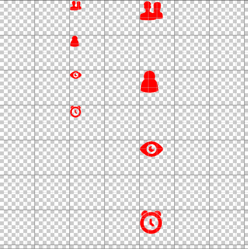
li { background: url(icons.png) -144px -72px; background-size: 256px 256px; }
li#item-2 { background-position: -144px 2px; }
li#item-3 { background-position: -144px -141px; }
li#item-4 { background-position: -144px -217px; }
Looking at the CSS example above, it should make it a little more clear that browsers which don’t support background-size will not scale the image and will end up pulling the images on the left.
Browsers that do support background-size will scale the image down and end up pulling the images on the right side, which are positioned proportionately so they are not only twice the size, but also at twice the coordinate values.
As I mentioned before, while this trick is cool and does work, I can’t actually find a good reason to use it! It still makes sense to separate out high-res and low-res graphics, if even for the sole reason that it produces smaller file sizes when they are separate (less for the browser to load).
That being said, it wasn’t that difficult to implement for a very small set of background images. If anyone actually comes up with a better use case for this technique, let me know!
Addendum
After publishing, I realized one possible use case for this technique: Client-side storage.
While combining low and high resolution graphics into the same file typically creates a larger download, this isn’t relevant to client-side applications, where the app’s “size on disk” requirements are more important.
One such instance is PhoneGap development. Since images will be loaded from the file system, a slightly larger image will not present any performance bottlenecks. However, two separate images, which combined equal a larger file size than a “merged” image, will created a larger app.